
The Food Truck
Providing a digital solution to America's food deserts
OVERVIEw
My Role
Interaction Designer
Duration
6 weeks
Type
Graduate project
Team
Product Managers Product Designer
Product Owner
Developers
Learning Engineers
Toolbox
Figma
Miro
Jira
Perceptyx
Contributions
User Research
User Interviews
Usability Testing
Prototyping
Interaction Design
Background
The CDC defines a food desert as an area that lacks access to affordable foods that make up a healthy, balanced diet. Additionally, by simply providing easier access to grocery stores in food deserts has shown to be insufficient in changing eating habits from processed foods to fresh, whole foods of the specific population.
Problem Space
My team was tasked with creating a digital solution that provides value and social impact to a community by focusing on a single issue. After ideating and throwing around several issues, our group decided on our problem space - addressing food deserts in the US.
Goal
We had to find a simple yet comprehensive way to address the issue of unhealthy eating and encourage inhabitants of food deserts to increase their consumption of healthy foods. We decided to accomplish our goal through the use of a food truck.
Goal
Our goal was to bring all of our various learning recourses and tools together into a one-stop shop. Making learning and development content easily accessible would empower users and provide them visibility to their current and future skill needs.
How might we improve learning and development for Boeing employees so that they can easily access & share knowledge and learning to evolve our workforce?
DISCOVERY
Research
We started by performing secondary research and data analysis from the various surveys that HR conducted throughout the company. They collected approximately 60,000 responses that needed to be organized and synthesized to better understand. In collaboration with the Learning Engineers, we created pivot tables and reports to calculate and analyze the data to identify trends and commonalities in the data.
What are the ideal ways to learn?
.png)
73%
preferred to learn new skills via online training
21%
liked to be hands-on and in-person
6%
relied on books or other similar methods to learn and grow their skillset
What currently works well?

82%
love the variety of learning resources that are available
16%
mentioned the outstanding quality of learning tools
2%
enjoyed other aspects like development visibility and the tuition reimbursement program
What should we improve?
.png)
69%
wanted a single location for all available learning resources
20%
expressed hatred for the current search functionality
11%
stated they’d love a way to connect with experts in certain areas and grow their knowledge
Proto-personas
Next, I took this information and formed proto-personas. While I hadn't yet talked to any of our users, I was still able to identify and from groups of similar characteristics, goals, and pain points. With the data and feedback from the surveys, I felt it would be beneficial to begin thinking about who are product would be for.
-
New Employees (0-5 years)
-
International Employees
-
Factory Employees
-
Contractors
-
Suppliers
-
SMEs/Learning Developers
-
Individual Contributors (5+ years)
-
Managers
-
Executives
-
Interns
User Prioritization
After I captured our target audience and presented it to the team, we moved into tackling our first challenge – with 10 potential user groups, how do we figure out who to focus on first? Enter Persona Prioritization.
Based off the findings from our secondary research, we discussed where there was potential overlap and prioritized our proto-personas. We focused on validating the highest priority personas first and subsequently cover the greatest percentage of our end users (given the total number of each user group in the company and user feedback from the surveys).
Additionally, there were certain restrictions that needed to be investigated deeper which ruled out some of our user groups for this first iteration.

We utilized a 2x2 prioritization matrix.
X Axis: Highest User Frequency to Lowest User Frequency
Y Axis: Highest User Benefit to Lowest User Benefit
After wrapping up our matrix, we landed on our top 4 user groups that we would focus on during the first iteration of Digital Campus:
Nate the New Employee
Years of service: 0 - 5
Goal: Learn skills for new role
Struggle: What & where to learn
Sam the Subject Matter Expert
Years of service: 10+
Goal: Share knowledge & expertise
Struggle: Finding communities
Ivy the Individual Contributor
Years of service: 5+
Goal: Upskill and advancement
Struggle: Locating resources
Maureen the Manager
Years of service: 7+
Goal: Distribute & recommend
Struggle: Employee and org needs
User Journey Map
In order to get the team to better empathize with our user groups and pinpoint exactly where our opportunities for improvement occurred, I facilitated a user journey mapping session which resulted in our team aligning on a collective mental model on the problem that we were trying to solve.


User Interviews
At last...it was time to circle back with our users from the initial surveys and hear how they truly feel! One of the Product Manager and I divided and conquered by successfully completing 20 user interview sessions. After the last interview concluded, I went to work synthesizing and making sense of all the feedback.
I presented the team with my key findings which included a more informed and defined list of user pain points and goals. Many of our initial findings and survey results still held true but now we had additional insights to support them:
77%
of interviewees mentioned using Google and/or YouTube as their starting point or an alternative because of its ease of use and relevant search results.
65%
of the sessions included users expressing an interest in easier ways to share knowledge or connect with other employees for their expertise and guidance.
40%
of users said they use the same few learning resources because they're easy to find and saves time on searching.
Persona Revisit
With the additional valuable input gathered from the user interviews, I fleshed out the proto-personas to create more defined user personas.


IDEATION
Design Studio
We finally had a well-defined problem space. 👏🏾 From here, we moved into brainstorming & ideation. I facilitated a cross-functional design studio and extended the invite to our Sponsoring and Organizational Managers to broaden our think tank and generate as many solutions as possible. After sketching and presenting our ideas, we all dot voted and easily identified top, common themes across our sketches. From here, I collected the drawings and began to compiling wireframes.


DESign
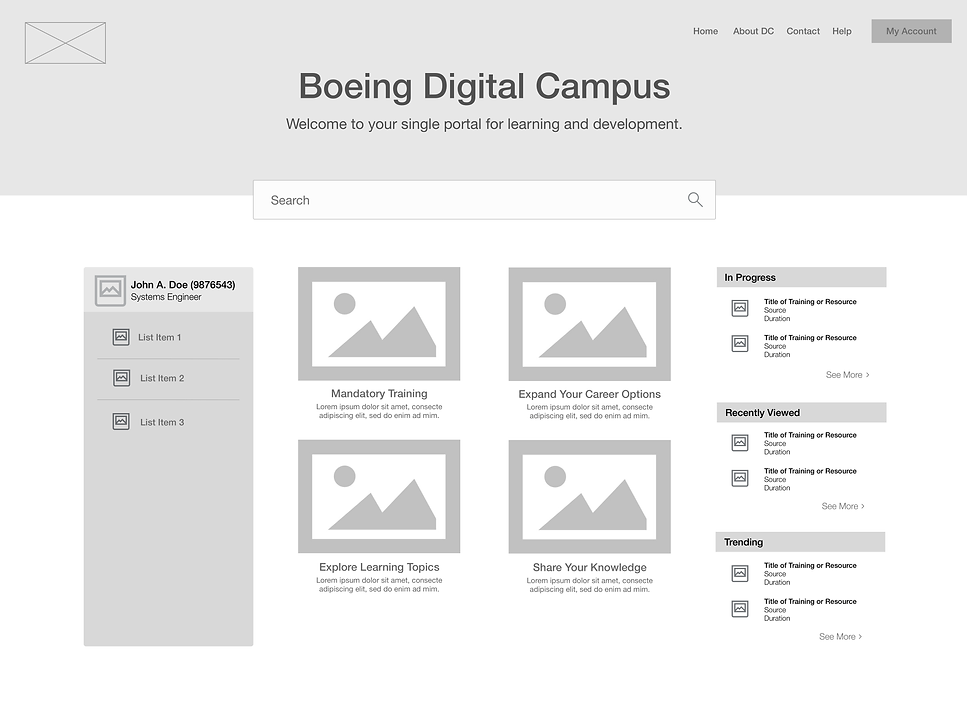
Wireframes
I eagerly got to work on bringing our team's vision to life. I created a homepage and search results wireframes and presented them to the team in the first of many design reviews. Initially, I created 2 options for the search results page - a left hand filter and a top filter and proposed that we A/B test the options.
Option A - Left Filter

Option B - Top Filter

Wireframe Revisions
After some back and forth conversations with the Developers and Learning Engineers, we learned that there were several technical constraints that would make features like the ‘Trending’ and ‘In-Progress Resources’ difficult to pull the necessary data and display. So I iterated on the wireframes and came up with V2 that was ready for some user feedback.


test & Iterate
Concept Validation
After rounding up some willing participants, I conducted 20-minute sessions with 6 users and received great feedback related to user efficiency, information architecture, and preferences:
I like how the content is divided into individual sections. It makes it so much easier to see what I have to choose from.
- Individual Contributor, Boeing Global Services
This definitely helps navigating to training easier but I think it would be helpful to know what's in each section and not have to click to find out.
- New Employee, Information Technology & Data Analytics
I prefer the left filter because it makes it makes the page less cluttered.
- Technical Fellow (SME), Software Engineering
I think breaking out the learning by org or business unit would be nice to help employees get quick access to the larger ecosystem of available learning.
- Senior Manager, Enterprise Services
Usability Testing
After gathering the input from validation and A/B testing, I conducted 2 more rounds of testing which focused on usability. I interviewed 15 additional users, gathered feedback, iterated on my designs, and began increasing the fidelity of wireframes.
During this process, we also had a checkpoint with stakeholders and leadership to highlight our progress and discuss next steps. After ending the second round of testing, I presented my final mockups for sign-off and hand-off to the Developers.


solution
Official Launch
Digital Campus was rolled out to the enterprise after 7 months of hard work and collaboration! It was added to our enterprise internal homepage and marketed widely to all of our 140,000 employees, domestic & international.
results & metrics
Follow up
Four months after Digital Campus launched, I worked with a team in HR to help launch another enterprise survey to get a pulse check on our product. We received over 25,000 responses giving us an update on how our product was doing. We were all extremely happy the tremendous impact we were able to make in such a large company.
96%
reported direct positive effect on growth
91%
discovered new learning tools and communities
73%
increase in traffic for lesser-known resources
key takeaways
Prioritization
When I started wrapping my mind around who I was designing for, I'll admit it was a bit overwhelming in the beginning. However, one of the most valuable exercises was the initial persona prioritization. When designing a product that touches a vast audience, it's important to remember: 1) the first iteration of your product more than likely won't be able to satisfy every user groups' goals and 2) as long as you stay focused on the top user pain points and helping users achieve their goals, you're on the right track.
Cross-functional Collaboration
Sometimes people think that "too many cooks in the kitchen" will lead to disaster. But I'm here to say that there's a valuable time and place when you have to strategically pick and choose who comes into the 'kitchen' and who to leave out. We ran into a number of issues related to feasibility and access that our Developers and Learning Engineers found early in my wireframes. Additionally, during our report-outs to leadership and key stakeholders, we had to pivot due to time constraints. We all had to get comfortable with pivoting and and staying in constant communication.