Centene
Center for Health Transformation
UX Strategy and Architecture
Redesigned a research repository to improve access to healthcare studies and findings
.png)
Quick facts
My Role
Freelance UX Consultant
Duration
7 weeks
(Jul - Aug 2021)
Team Members
Sr. Creative Director
Project Manager
Creative Team
Developers
Data Engineer
Client
HLK Agency
Platform
Desktop
Deliverables
Research
Site Audit
UX Recommendations
Information Architecture
Wireframes
Background
The Centene Center for Health Transformation (CCHT) is a “community, industry, academic healthcare partnership that advances life-centric health solutions to improve lives so that communities can thrive.” Partnering with Washington University in St. Louis and Duke University, the site provides healthcare professionals with relevant and valuable findings. In other words, CCHT is a research team that identifies healthcare issues to inform evidence-backed solutions.
The problem
The current website did not deliver the accessibility that users needed. A lot of the content was buried behind paywalls or difficult to track down across various sites, publications, and academic journals. Additionally, there was no easy way to filter or sort the findings. This resulted in high bounce rates and lower traffic to important pages.
My goals
I was hired by HLK Agency to work with their in-house product and creative teams to improve the CCHT site by making it a more logical and user-friendly website. The main goal was to allow the site to be a destination for an easily digestible healthcare research hub. We wanted users to explore beyond the content they were searching for and remain engaged. As the UX Consultant, my duties included:
UX Audit
Evaluate the existing website and identify user pain points and other problem areas
UX Recommendations
Provide improvement recommendations and business rationale
Wireframes
Create wireframes focusing on improved information architecture and design

Auditing the existing experience
I began by evaluating the current CCHT site and walked through each page of the site, identifying UX challenges and compiling my findings in a slide deck. Additionally, I researched and compared other educational and resource tools to brainstorm how I could improve our site. During the presentation of my findings, I identified a list of areas that made overall navigation difficult including inconsistent page behavior, dead-end links, disjointed page content, mislabeled titles and headers, cognitive overload, and lack of content prioritization.

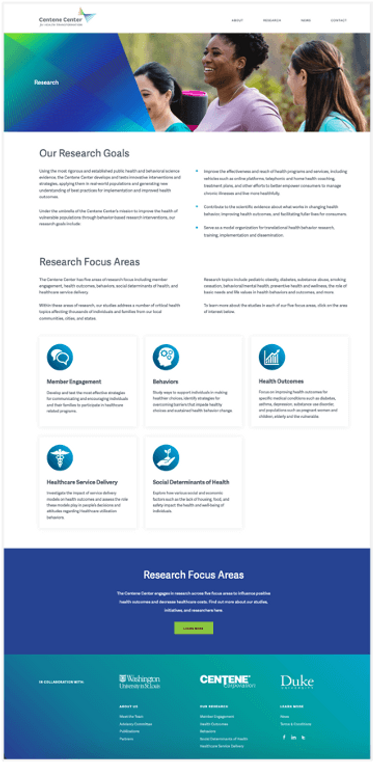
Issue: When navigating to the Research page, the user encounters a page of text where the intended action is to view research findings.
Cognitive Overload
Recommendation: Combine and condense ‘Our Research Goals’ and ‘Resource Focus Areas’ at the top of the page to allow users quicker access to the research.
Lack of CTA Affordance
Issue: The tiles under the 'Research Focus Areas' are clickable but the lack of affordance when hovering the interaction does not inform the user that they're clickable.
Recommendation: Add some type of affordance to the tiles to let users know they are clickable and more relevant content is available to view.
Unexpected CTA Behavior
Issue: When the green Learn More CTA is clicked, the user is brought to the top of the same page.
Recommendation: Remove the Research Focus Area banner since the user is currently on that page or utilize the banner and CTA for a different page destination.
Issue: Menus and page names do not match.
Inconsistent Titles & Headers
Recommendation: Ensure that all page titles are consistent with the menu titles to eliminate confusion and improve SEO.
Duplicate CTA Style
Issue: The 'Share' button style is the same as the article tags which can lead to confusion.
Recommendation: Differentiate the button style and use unique icons for separate actions.
No Search and Excessive Pagination
Issue: With 14 pages of articles, a user is unable to search, sort, or filter to find specific content.
Recommendation: Add the ability to search, sort, and/or filter and utilize truncated pagination.

Implementing my recommendations
I created wireframes for a total of 10 pages that prioritized easy navigation, functionality, and strategic layout. Below are a couple of examples of my wireframes compared to the implemented webpage:
Recommended Homepage
.png)
%20(1).png)
Live Homepage
Recommended About Us
.png)
Live About Us
.png)
Going live
During the summer of 2022, Centene rolled out the new and improved Center for Health Transformation! I was thrilled to be a contributor to a tool that will help facilitate higher education and learning in the healthcare industry. The site provides a more streamlined and comprehensive way to search and find valuable content that users seek.
70% increase in overall user traffic and a 55% increase in clicks on new and existing articles.
After 3 months, Centene reported a tremendous increase in audience engagement with CCHT research content, average user time spent on pages, and scroll depth. We met and surpassed our success metrics by providing a quality redesign for an innovative health resource.