Microsoft
Growing Home
UX Design & Strategy
Designed a unified, digital hub that showcases Microsoft's partnerships and development opportunities for communities in rural America
%20(1).png)
Quick facts
My Role
Freelance UX/UI Designer
Duration
3 months
(Apr 2021 - Jun 2021)
Client
Listen Agency
Team Members
Creative Director
Product Manager
Copywriter
Full stack Developers
Platforms
Desktop
Mobile
Tablet
Deliverables
Research
Content Strategy
Information Architecture
Storytelling
Sitemap
Wireframes
Mockups
Prototype
Background
In recent years, Microsoft invested millions of dollars in closing the opportunity gap for residents of rural America. Measured in access to broadband, healthcare, STEM education, or job opportunities, rural America was being left behind. In efforts to combat the long-standing issue, Microsoft teamed with local partners and kicked off several innovative initiatives: Airband connectivity, supporting youth through 4-H and FFA, educational programs like TEALS and TechSpark, and modernizing agricultural data to name a few.
These initiatives are highly effective but were difficult to communicate in a simple and concise way that provided a voice for rural America and reflected Microsoft’s community-led approach.


Several examples of Microsoft's initiatives and supporting programs
Scope & approach
I was hired by an advertising and marketing firm called Listen to create a unified, digital hub for all of Microsoft’s rural initiatives. Currently, users had to search each program individually to find information and/or data. As a result, this made the initiatives feel disparate and behind the scenes.
Microsoft’s overall goal for this new site was to highlight the commitment to geographically based investments and create a connected platform to unite impact for rural communities. In the creative brief, there were 3 key requirements called out:
1
There are multiple audiences and programs to cover but we need to create a cohesive story before opening different user journeys.
2
UNIQUE
(Reflect vs. recreate)
3
We can reflect language from other Microsoft and partners pages, but we also need to be a unique resource and POV.
If someone visited the hub for just 30 seconds, would they walk away with a new awareness of why growing rural opportunity matters?
UNIFIED
(Simplify + Prioritize)
URGENT
(Advocacy in 30 seconds)
The right audience
I began by performing desk research on various materials provided by the client. One resource included a ‘Microsoft and Rural America’ background case written by Mary Snapp (Microsoft Vice President of Strategic Initiatives). In this write-up, there was a breakdown of demographic information, helpful context and statistics on Rural America, the in-depth story of Microsoft’s involvement, the current competitors, and measures of success.
I knew that many of the sites that needed to be included in the site would be relevant across a variety of user groups but prioritizing them would be critical. Ultimately, our team’s broadest objective was to create and foster goodwill among the most powerful and important stakeholders within the rural areas: state and local officials, corporate leaders, and community influencers. However, to achieve this goal, the strategy was to first make a positive impact on the citizens who influence the previously mentioned.

The primary audience is students, parents of students, small business owners, non-profit leaders, and constituents.
Organizing the structure
After understanding what we were being asked as a team and what my individual responsibilities were, I started by mapping out how the site would be structured via a sitemap. Based on the information captured in the brief, I included all the key areas that were highlighted. This is when the first challenge occurred – because I was not a part of the meetings that were taking place with the client, things were constantly shifting. I ended up creating 3 iterations of sitemaps before landing on the final one.

Building out the site
Following sign-off of the sitemap, I created a total of 5 desktop wireframes. Microsoft has a well-defined design system so I used low-fidelity components of it as I built out my wireframes. Because we had a time constraint and the sitemap discussions took longer than expected, I focused my attention on designing for desktop first, with the expectation of designing for mobile after approval of the desktop screens.
Click wireframes to enlarge


Iterating on client feedback
The first client tag-up consisted of wireframe approval. We met with the Microsoft team and I walked through my wireframes. During this time, the MS team asked questions, raised concerns, and got a better understanding for the product that we were creating.
We went through several rounds of iterations, cutting and rearranging content, adding information, as well as ensuring overall site structure compliance.
Remaining on brand
After the last wireframe iteration and the wireframes were approved, I began reviewing the design system. Like most big and established companies, Microsoft has an extensive and rigorous set of styles, components, and brand guidelines. Before increasing the fidelity of my wireframes, I needed to familiarize myself with them.


Increasing the fidelity
I began incorporating colors, images, typography, and placeholder images into my wireframes. We collectively went through 6 iterations of wireframes before landing on the final mockups that Microsoft was happy with.


Change of plans
During a review of my mockups with internal Microsoft leadership, there needed to be a final change of direction. Microsoft was unable to alter the style of their program pages and several features (like 'Advocacy' and 'Getting Involved' pages) would not be immediately ready by the go-live date. This meant that I needed to remove and consolidate my design into a single landing page.
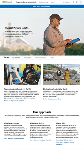
The outcome
Finally, I was able to present my updated mockup and hand it back over to Microsoft. Their leadership team loved the updated design. The client and my product team was appreciative with my ability to consistently pivot and still incorporate the client's request. The final solution offers users a simplified glimpse into the beneficial partnerships and programs that Microsoft offers while telling a story to users who may be unfamiliar.


Lessons learned
Remaining resilient: There were a variety of challenges that I had to overcome in a relatively short period of time. However, I was still able to remain agile with my designs and deliver a product that met both business and user needs. Additionally, there were plenty of times that I wanted to design something unique for this particular site but the Microsoft team was required to stick with their traditional UI. Though I couldn’t add my normal sparkle to this product, it was still cool to work on a product that told a story of Microsoft positively impacting America.
Team member feedback

